DISCLAIMER: Don’t take the following too serious - when reading this post please keep in mind that the TYPO3 community itself consists of much more than just the Core team activity - many things take place outside of code repositories and can’t be measured anyhow. Every contribution is important and every single action has value.
Using Gerrit sometimes feels quite lonesome - you don’t really see who’s active and you don’t really get a feeling on how much is done in the TYPO3 Core at a certain point. To visualize on how active the contributors are and to show the most active members I applied a little scoring and summed up the results for the time since 2006.
The scoring is quite easy - every author of a patch gets 10 points, testers get 3 and reviewers 1 point*. Looking at the stats it seems that even the statistics pulled from the old Subversion days seem to meet up with today’s numbers - of course we’ve to keep in mind that everything which was pulled from Subversion doesn’t really point to the author but to the actual committer (except if there was a “Thanks to XXXXX” reference in the commit).
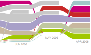
To visualize the numbers I choose a Github like impact chart**. Each contributor has it’s own color and line in it and whenever he got active the width of the line scales up. To maintain the overview the scale of the width isn’t linear and every contributor who’s not within the “Top 20” had to be scaled down to “1”. The line stops if the contributor didn’t get active anymore. The scores are grouped and compared by month.
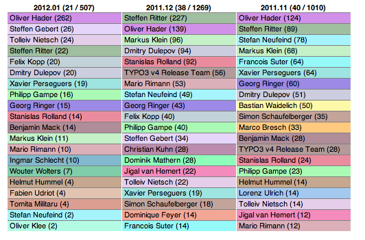
In addition to the chart I also created a table based overview for the “Top 20” contributors with their score***.
Few things I got from the numbers. There have been 290 contributors already - simply amazing. Comparing the (huge) scores of the release managers with their fellow contributors shows once more that they can be really proud about the job they did or do. It’s also quite cool to see that many people keep sticking around. And finally it was quite surprising to see that our community manager Ben van’t Ende can also be found in the stats. Besides that it’s up to everyone else to find their conclusions from these numbers. I hope it’s motivating everyone to see that the community is active as always.
The script I created to generate the charts isn’t too nice at the moment, but I promise to publish it once I cleaned it up a bit. If you can’t wait to get your hands on it, feel free to send me a mail or tweet. - but I published it anyways: github.com/tolleiv/Repo-Activity-Monitor
Links in short: Impact chart, Monthly “Top 20” tables.
- The scoring includes the commits to the Core master and all related submodule commits. Unfortunately the submodule commits don’t hold the reviewer and tester information. Also some of the latest changes made in the submodules may not show up at the moment because the submodule pointers haven’t been updated yet.
** Inspired by the incredible RaphaëlJS vector graphics library which is distributed with an MIT license and can be found on raphaeljs.com
*** Again - don’t take it too serious - the scoring doesn’t take into account that some patches can be written in 15 minutes where others take days. It also only uses the final testers and reviewers mentioned in the commit message, other contributions are not counted atm