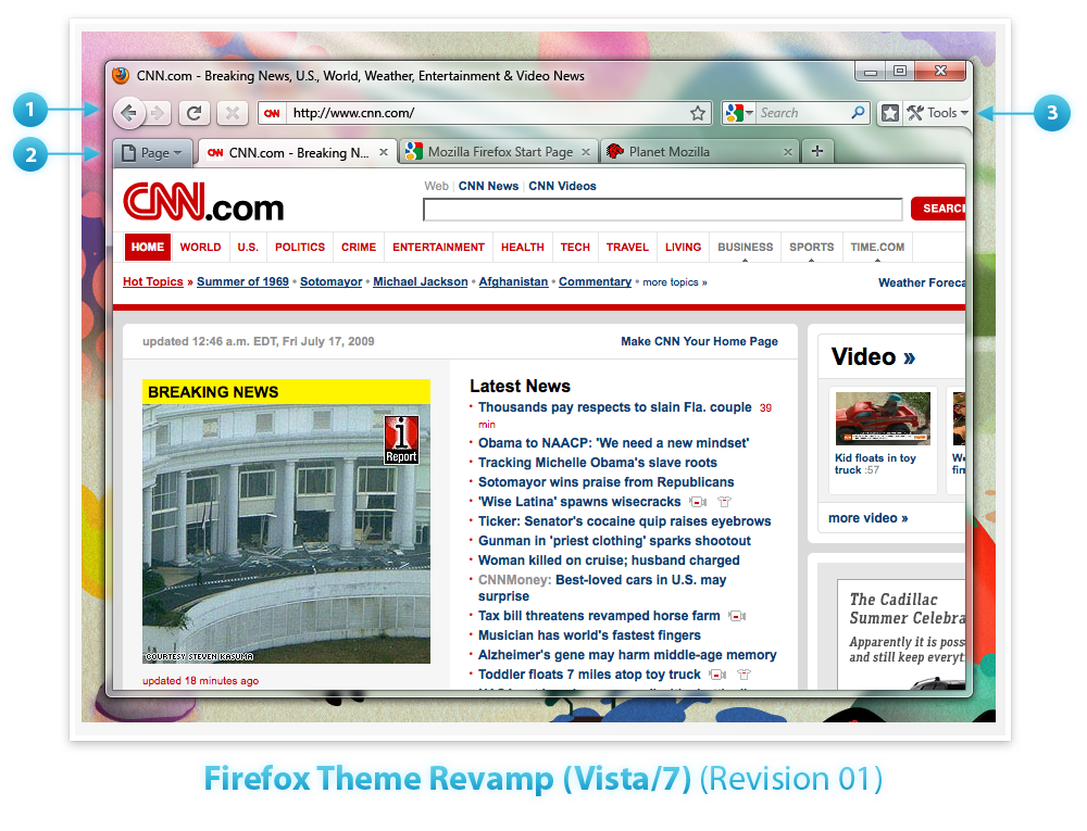
I just stumbled over some Firefox 3.7 screens. It seems that the mozilla developers plan/brainstormed to change same smallers parts:
Embracing Glass: Toolbar and Tabs using Glass. Buttons translucent and slightly glossy to meld with the toolbar. Raised 3D lookachieve tactile “feel”.
Page Button: Connect the Page button to the left side of the tab area. Directly connected to the Page.
Tools/Bookmark Bar: Connecting the Tools button to the side of the Window to emphasize the fact that it is used for customizing and changing the UI. Adding a button next to that to toggle the Bookmarks Bar which is turned off by default.

Looks pretty cool - but see yourself wihin the mozilla wiki.